
Flex Onboarding
Turning Gig Applicants into Qualified, Booked Workers

TEAM
Product Manager, Design Lead, Tech Lead, QA
MY ROLE
Senior Product Designer
TOOLS
Figma, User-Interviews, Questionnaires, Hotjar
CONTEXT
Flex is the worker-facing app in the Jitjatjo ecosystem — the tool gig workers use to apply, onboard, and manage their shifts. Onboarding is the first real test of that relationship: it has to feel fast and trustworthy to the applicant, while giving Jitjatjo everything it needs to verify that person meets its operational standards.
My Role: I worked closely with the Design Lead, Product Manager, and developers throughout, with continuous input from real applicants moving through the onboarding journey — so the design was never guessing at where people got stuck.
PROBLEM
A Difficult Balance of Speed and Assurance
Every extra step in onboarding is a chance for someone to drop off. But every step removed is a compliance risk Jitjatjo can't take. The existing flow leaned too far toward the business's needs — too many steps, unclear progression, and third-party tools bolted on in ways that didn't feel like part of the same product.
Applicants needed to:
Move through onboarding quickly, without feeling like they were filling out endless forms
Understand where they were in the process and how much was left
Be able to stop and pick back up later without losing progress
At the same time, Jitjatjo needed to:
Collect enough capability and accreditation data to qualify applicants for compliant role
Route people into the right assessments, background checks, and HR forms without manual chasing
The problem was how to design an onboarding flow that:
Felt short and simple to the applicant, even while collecting everything the business needed
Made resuming after an interruption completely seamless
Folded third-party tools like scheduling and background checks into one cohesive experience, instead of visibly bouncing users elsewhere
RESEARCH & INSIGHTS
Because onboarding was the first thing every applicant touched, we had a constant, high-volume stream of behavioural data to learn from — not just interviews, but real drop-off patterns as they happened.
Key inputs included:
Early onboarding usage data, watching exactly where in the flow people slowed down or stopped
Intercom feedback from applicants who ran into friction or confusion mid-process
Conversations with recruitment and vetting teams, who understood which steps mattered most for qualifying candidates
Customer service escalation patterns — when applicants abandoned the flow, CS had to proactively reach out to bring them back, which was itself a signal something in the design wasn't working
"I got halfway through and then just... didn't know how much was left."
— talent feedback
"I wanted to finish this on my break, but I couldn't come back to where I left off."
— talent feedback
A few insights shaped the direction:
Structure reduced cognitive load. A clear, step-by-step model made a genuinely complex process feel manageable, rather than open-ended.
Third-party tools needed to feel native. Whether it was interview scheduling or document checks, the moment a tool felt like it belonged to someone else, trust dipped.
Onboarding rarely happened in one sitting. Applicants moved through the flow across multiple sessions, so being able to resume exactly where they left off wasn't a nice-to-have — it was essential to completion.
PROCESS
Lean, iterative approach
The goal was to get something real in front of applicants fast, then adapt — a "move fast toward an end result" approach rather than a long upfront design phase.

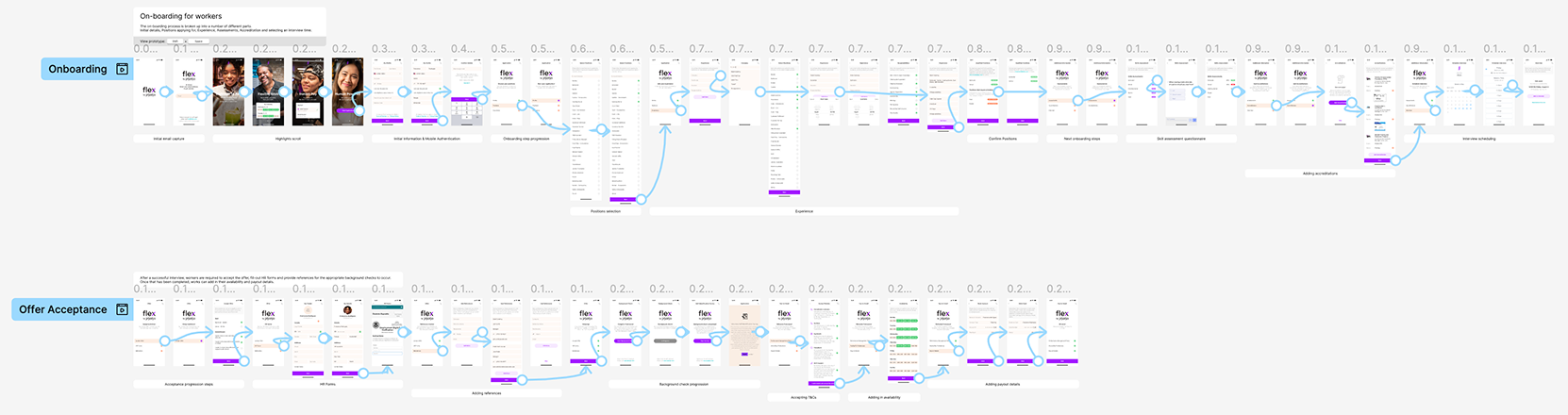
Early user flows mapped the entire onboarding journey end to end, which surfaced natural groupings of tasks. Those groupings became four major sections:

High-fidelity Figma prototypes were shared with stakeholders and real users for rapid validation before any of it reached engineering. Particular attention went to edge cases — interrupted sessions, or points where an applicant might get blocked or quietly drop off without anyone knowing why.
1.
Profile
Positions
Experience
2.
Assessments
Accreditation’s
Interview
3.
Accept Offer
HR Forms
Background Check
4.
Policies
Availability
Payout
SOLUTION
A modular, guided onboarding experience
The final design introduced a modular, guided onboarding experience with a clear sense of progression. Key elements included:
A step-by-step structure that broke onboarding into manageable sections, giving users clarity and reduced overwhelming them.
Integrated assessments and accreditation uploads, ensuring roles with compliance requirements could be vetted properly.
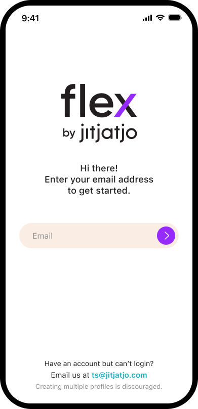
Embedded third-party tools such as Calendly for interview scheduling, presented in a seamless way that maintained trust.
A resume-later system that allowed users to return to where they left off, supporting real-life interruptions.
The experience balanced design clarity with operational requirements, ensuring both users and internal teams received the information they needed.


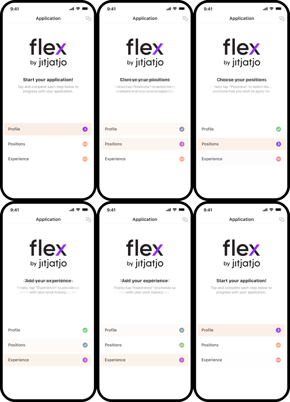
Visual Progress Feedback
Each of the four sections was broken down into three steps, with visual feedback showing applicants exactly how far they'd come and how much was left — turning a long process into a series of small, achievable wins.

Layered Safeguards
Safeguards ranged from simple to significant: certain positions required experience to be logged for admin review and approval, roles carried mandatory skill assessments, and applicants could add role-specific accreditations to widen the gigs they qualified for.

Native Third-Party Integration
Calendly powered interview scheduling, HR W-2 forms were embedded directly, and background checks and a Voluntary Self-Identification survey ran inline — all without applicants feeling like they'd left the app.

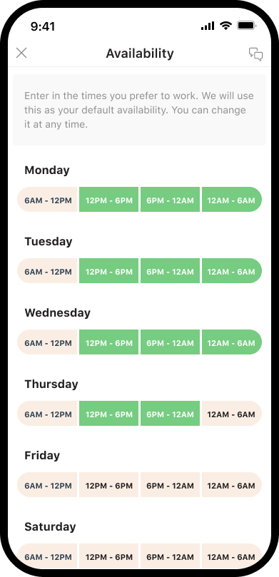
Choose-Your-Schedule
Since flexible hours were one of the biggest reasons workers joined the platform in the first place, a simple tap-to-select scheduling interface let applicants set their availability directly and immediately.
IMPACT
48%
reduction in onboarding drop-off
55%
increase in completed applications
~80%
reduction in CS interventions needed to recover stalled applicants
Beyond the numbers, the redesign changed how onboarding felt on both sides:
Applicants moved through a process that felt short and clear, even though it was collecting everything the business needed underneath
Resuming after an interruption stopped being a reason to abandon the application altogether
Jitjatjo's ability to qualify applicants accurately improved, backed by structured, complete data instead of gaps filled in later by CS
Fewer applicants needed manual outreach to finish what they'd started, freeing customer service to focus elsewhere
REFLECTION
Designing for gig workers meant designing for fragmented time and attention — the flow had to work whether someone had twenty uninterrupted minutes or ninety seconds on a break.
The biggest takeaway was that modular structure, visible progression, and tolerance for interruption aren't nice UX touches in a gig-economy context — they're the difference between someone finishing and someone giving up.
Balancing user psychology against operational constraints — collecting real compliance data without it feeling like a compliance form — required careful hierarchy, visual clarity, and constant feedback loops with real applicants, not just stakeholders.
The result successfully balanced business, compliance, and user needs within a single, cohesive onboarding experience.