
Creating and Maintaining an In-House
Design System and Component Library

MY ROLE
Senior Product Designer
TEAM
Design Team
TOOLS
Sketch, Abstract, Zeplin, Figma
CONTEXT
The company underwent a significant rebrand early in its life, and the design team saw it as a chance to do more than swap out colours. It was an opening to establish a unified visual identity across the entire product suite, built on a structured design framework aligned with the new brand ethos.
The system started life in Sketch, published to front-end developers via Abstract and Zeplin. As Figma emerged as the dominant design platform, and the clear benefit of an all-in-one tool became obvious, the system moved over to it. There was no simple way to import a .sketch file into .fig at the time, so most of the library had to be rebuilt from scratch rather than migrated.
THE BASICS
Colour Identity
The branding agency had established the core colour palette, but their focus was marketing, not product. The design team's job was to flesh those core colours out: defining secondary, supportive colours, and the appropriate hues needed for hover states, press interactions, and everything in between that a static brand guideline doesn't cover.
Primary and secondary palettes were built out to support real interface states, not just marketing collateral.
Primary Colours

Secondary Colours

Purple was used deliberately, not liberally. The brand's main purple was strong enough that the team made an early call to reserve it almost entirely for primary calls to action, keeping it meaningful rather than diluting it across the interface.
A clear button hierarchy emerged: primary call to action, secondary call to action, and a lighter supplementary text link, each with a distinct visual weight matched to its importance.
Primary call to action

Secondary call to action

Supplementary text link

INSPECTION
Every Jitjatjo product deals in heavy amounts of data that admins, managers, and workers all need to digest quickly. Imagery plays a limited role; the real objective is keeping information clear and organised.
The core challenge was showing that volume of data in a way that stayed visually appealing and genuinely easy to read. The response was to declutter aggressively:
Clean layouts with generous white space, rather than dense, boxed-in information
Removal of superfluous effects like drop shadows that added visual noise without adding clarity
Iconography used only where it genuinely supported the data, not as decoration
Graphic treatments like progress bars used deliberately, as an alternative to defaulting to a raw number on screen


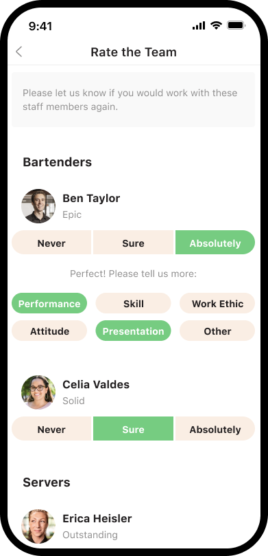
Old vs new design look and feel
"We didn't want the interface to compete with the data it was displaying."
That principle, more than any single visual rule, guided the shift from the old design to the new one.
THE ROLLOUT
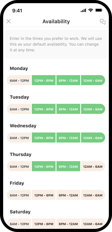
The updated brand and system rolled out across the full Jitjatjo product suite, spanning Flex onboarding and OnDemand branding, so that every touchpoint felt like part of the same product family rather than a patchwork of individually rebranded screens.




ATOMIC DESIGN SYSTEM
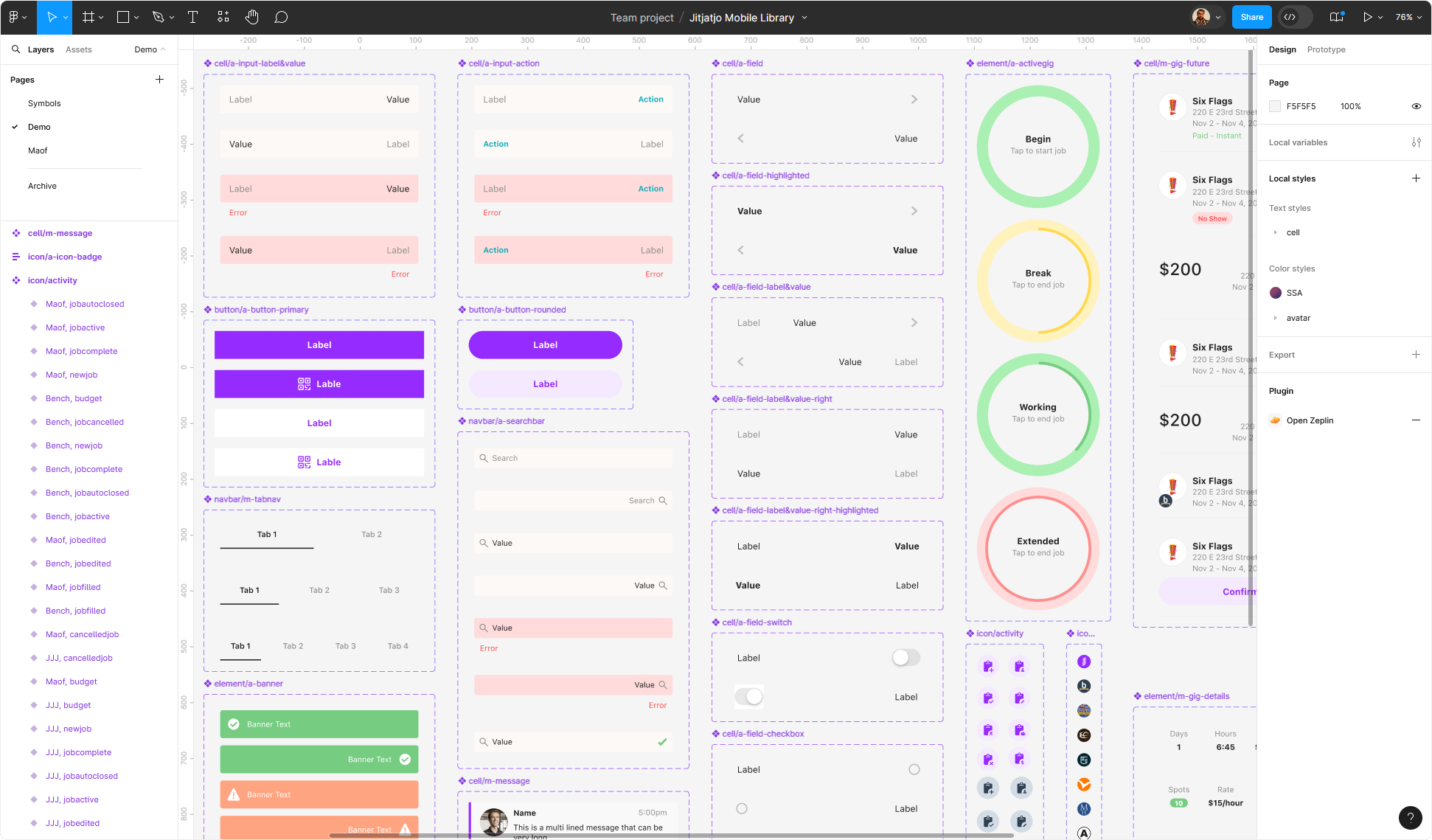
The system was built on atomic design principles: breaking interfaces down into fundamental building blocks, then combining those smaller pieces into larger "organisms" and working back up from there. Once that foundation was set, rolling out individual elements and their variations became a matter of consistent execution rather than reinvention.
The library covered both Web and Mobile App platforms from the outset, so nothing had to be retrofitted later to work across devices.

Teamwork kept it alive.
Responsibility for adding to and maintaining the design system was spread across the whole design team, with a dedicated weekly catch-up to review new elements and any tweaks needed to existing ones. That cadence meant updates rarely broke something else downstream.
Components earned their place.
A new component was only added to the system if it emerged from a real project ticket and had clear relevance to future use cases, not simply because it looked reusable at the time.
HIGHLIGHTS
A genuinely unusual challenge arrived once the design library was already established: a new client in the Israeli market meant rolling out the entire Jitjatjo product suite in a right-to-left layout. Every component needed to work, and read, from right to left, not just have its text direction flipped.


"It wasn't just mirroring the layout. Every component had to actually make sense read the other way."
That distinction, between visually flipping a screen and genuinely redesigning it to read correctly, was what made the RTL rollout a real design challenge rather than a technical afterthought.
REFLECTION
End result
The full rebrand across core products and the website was completed in under a month. Front-end development followed close behind, implementing the work in a further two weeks. That pace only held together because of tight coordination across design and engineering throughout.
The wider payoff extended beyond the rebrand itself: the Jitjatjo platform has since been licensed to several major enterprise organisations, and in early 2024 Jitjatjo secured a Series B funding round of US$30M.
A design system built with real discipline, deliberate colour use, atomic components, and a team rhythm to maintain it, turned out to be foundational to how quickly and confidently the whole product suite could evolve.