
Dash
The Internal Command Centre for a Multi-Sided Talent Marketplace

MY ROLE
Senior Product Designer
TEAM
Product Manager, Tech Lead, QA
TOOLS
Figma, User-Interviews, Questionnaires, Hotjar
CONTEXT
Jitjatjo runs a multi-sided talent marketplace, matching businesses with on-demand and flexible workers across the US, Australia, and Israel. Behind the scenes, five internal teams — recruitment, customer service, HR, operations, and system administration — all rely on a single back-end platform to manage talent, clients, jobs, matching, payments, and the operational fires that come with running a live marketplace.
That platform is Dash: the console where data from all three Jitjatjo applications converges into one place.
My Role: I owned the end-to-end design, evolution, and upkeep of Dash — user research, UX strategy, UI design, prototyping, system architecture, component design, and close collaboration with engineering.
PROBLEM
Tedious Workflows Hindering Efficiency
Dash already existed, but it had grown the way most internal tools do: one feature at a time, under deadline, with no one stepping back to look at the whole. As the product and company scaled, that started to cost real time and trust.
Admins were expected to:
Track jobs, talent, and clients across three markets at once
Catch and resolve operational issues before they escalated
Reconcile payment discrepancies across very different pay structures
Do all of this inside a system that looked different on every page
At the same time, leadership needed:
Reliable, at-a-glance visibility into KPIs and trends
Confidence that different admin teams were seeing the right information, not everything or nothing
The problem was how to design an internal system that:
Surfaced the right information to the right admin, at the right moment
Turned scattered, third-party-hosted data into something admins didn't have to go hunting for
Could grow without every new feature reinventing the page around it
RESEARCH & INSIGHTS
Because our “customers” were internal, I had direct and frequent access to the people using Dash:
Admin interviews to understand workflows, pain points, and where information was missing or overwhelming.
Slack issue-channel analysis where real-time operational problems surfaced, showing how admins triaged urgent issues and what information they needed at each step.
Role-specific conversations to identify what each admin type needed to see first and most often.
Usability observations of admins using existing pages to reveal where data hierarchy and priority needed restructuring.
"By the time I've found the right page, the issue's already gotten worse."
— Customer service admin
"I don't need to see everything — I need to see what's mine."
— Hiring manager
A few insights shaped everything that followed:
Complex, expanding data.
Admins were navigating large volumes of job, client, talent, and matching-algorithm data, often under time pressure.
Payment transparency across markets.
Pay structures differed significantly between the US, Australia, and Israel, and without a clear breakdown, disputes took far longer to resolve than they should have.
Different roles, different needs.
Recruiters, service-delivery admins, and HR teams needed visibility into entirely different data sets and workflows — a one-size-fits-all view served no one well.
No shared structure.
Without templates or a design system, every new page was designed in isolation — consistency was accidental where it existed at all.
"Fires" were hard to triage.
Alerts and problem states weren't surfaced in context, so admins had to go looking for the very issues that most needed their attention.
Mobile had real limits.
Heavy data tables and dense workflows made it clear early on that not every admin function belonged on a small screen.
PROCESS
Lean, Iterative Approach
We prioritised speed: create low-fidelity prototypes, test rapidly with admins, then refine. Admin users were available daily, which made continuous iteration extremely effective.

Low-fidelity templates
Rather than designing pages one by one, I built baseline templates for the core page types Dash was actually made of:
List views
Detail pages
Forms and modals
Payment summaries
Issue overlays
Dashboards
These templates became the foundation for every screen that followed — consistent by default, flexible where a specific workflow genuinely needed it.
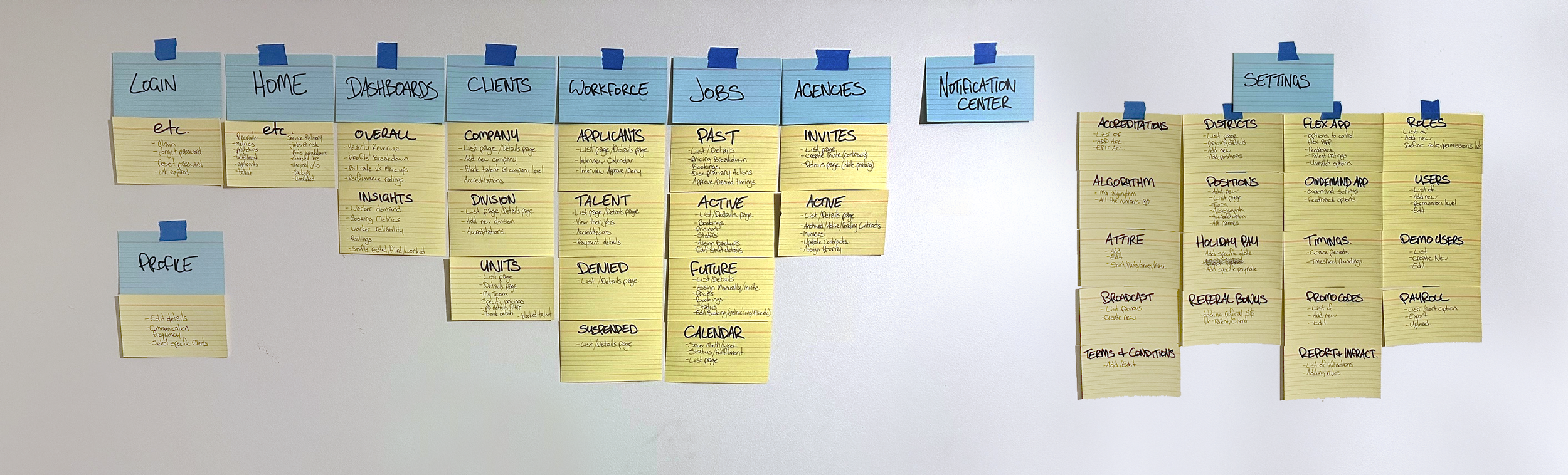
Component-based design
As patterns proved themselves through testing, I formalised them into a design system: shared components with predictable behaviour, so future features could be built quickly without redesigning the wheel — or breaking consistency in the process.


SOLUTION
The final product turned Dash from a patchwork of admin pages into a coherent operational hub, built around role clarity, transparency, and scale.
Role-Based Home Screens
Every admin type has different priorities, so I designed distinct home screens for each — a recruiter/HR view and a service-delivery view — each surfacing only what that role needed to act on. This alone significantly cut the noise admins had to wade through before they could get to work.

Example of recruiter dashboard

Example of customer service dashboard
Calendar View
Admins needed something more visual than a job list to plan around. Inspired by tools like Google Calendar, I designed a pill-based month view with expandable daily timelines, giving quick access to job details and job state without leaving the calendar.

Calendar with fulfillment metric
Metrics Dashboard
We moved away from relying solely on Grow.com, which had become a styling constraint rather than a tool. The new dashboard surfaced revenue and profit, client breakdowns, and trend comparisons — clear at a glance, with room to dig deeper when a number needed explaining.


Metrics dashboard catering to different users needs
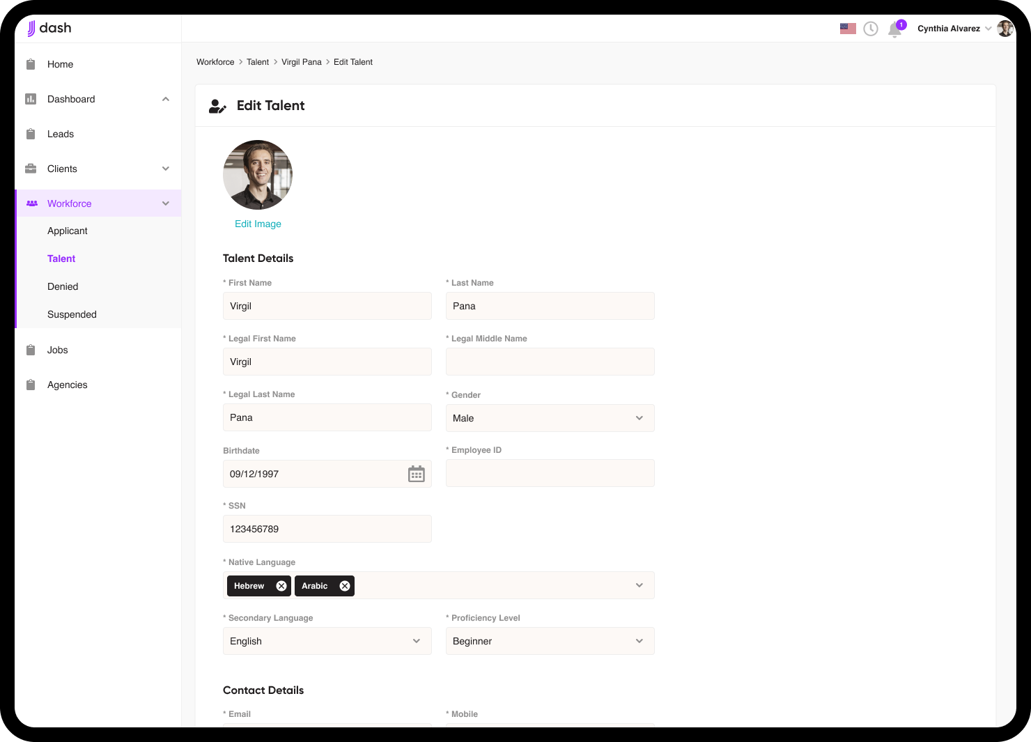
Payment Transparency
I designed a detailed pay-breakdown system covering base pay, casual loadings, penalty rates, overtime, market-specific structures across the US, Australia, and Israel, and add-ons like travel or promo codes. Where payment discrepancies used to mean back-and-forth between admins and talent, they now started with a clear, shared breakdown.


Example of US pay breakdown versus Israeli pay breakdown


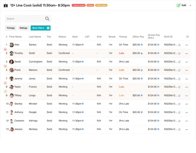
Operational Issue ("Fire") Handling
Instead of a separate issues page admins had to remember to check, I embedded issue indicators directly into the places admins already worked — inline job and talent alerts, severity levels (major / mid / minor), job status bars, and enough contextual information to act immediately, not after a second lookup.

Mobile Responsive
We aimed to keep Dash usable on mobile, but several challenges emerged. Dense tables and heavy workflows didn't translate to small screens without sacrificing usability. Rather than force a compromised experience, we made a deliberate call to optimise Dash for desktop and treat mobile as a lighter, secondary view.


Specific pages considered for mobile
IMPACT
Operational Efficiency
Admins could find critical information faster, reducing time spent jumping between systems or views.
Improved Decision-Making
Leadership gained better visibility into KPIs, trends, and anomalies.
Reduced Payment Confusion
Clear breakdowns lowered talent disputes and simplified admin support.
Faster Response to Issues
Embedded, contextual issue handling allowed admins to resolve urgent problems much more quickly.
Scalability
Templates and reusable components meant new features could be added easily without compromising consistency.
High Engagement with Users
The iterative feedback loop fostered a strong relationship between product and internal teams, ensuring the system matched real-world needs.
REFLECTION
Internal products deserve the same design attention as customer-facing ones — the fact that the "customer" sits two desks away doesn't make their time or trust worth less.
Role specificity turned out to be one of the highest-leverage decisions in the whole project: tailoring what each admin group saw first did more for efficiency than almost any individual feature.
Not every data-heavy tool needs to be fully responsive. Forcing complex tables into a mobile layout can hurt usability more than skipping the effort — knowing when not to build something was its own kind of design decision.
Building templates early prevented design debt later, and having daily access to real users made iteration faster and far more honest than research phases usually allow.
Dash ultimately evolved into a clear, robust operational hub that supported Jitjatjo's growth across multiple markets.