
Assigning Jobs through
Agency Network

MY ROLE
Senior Product Designer
TEAM
Product Manager, Tech Lead, QA
TOOLS
Figma, User-Interviews, Questionnaires, Hotjar
CONTEXT
Agency Network is the part of the Jitjatjo platform that lets external recruitment agencies view available jobs and assign candidates from their own talent pool. Unlike internal admin tools such as Dash, this feature served an entirely external audience — agency clients who needed job details, requirements, and assignment actions to be clear at a glance, with no internal context to fall back on.
My Role: I led design on this feature, working closely with the Product Manager and front-end/back-end developers, with direct input from recruitment agencies shaping the flow throughout.
PROBLEM
A gap in the market
Before this existed, recruitment agencies were largely working from paper trails and manual processes to find and assign talent — there was no digital equivalent that matched how they actually worked.
Agencies were dealing with:
Job details scattered across emails, PDFs, and spreadsheets.
No consistent way to track who was assigned where
Difficulty matching suitable workers to job requirements — skills, accreditations, availability — without cross-referencing several sources by hand
The problem was how to design a clean, structured experience that let agencies:
View jobs at a glance, without wading through detail they didn't need yet
Drill into full job requirements the moment more detail was needed
Assign talent quickly and accurately, with confidence the match was right
RESEARCH & INSIGHTS
Research centred on recruitment agencies themselves — understanding their existing workflows, the tools they were cobbling together, and where those tools broke down.
Key inputs included:
Recruiter interviews to map workflows and surface where information was missing, duplicated, or overwhelming
Direct feedback from agency clients already managing job assignments through manual means
"Right now I'm managing this across three different spreadsheets and my inbox."
— recruiter interview
"I just need to know — at a glance — what's filled and what isn't."
— recruiter interview
A few insights shaped the design:
Agencies needed to scan, not read. With multiple jobs open at once, the ability to skim a list without reading every field mattered more than dense detail up front.
Worker selection had to be fast and filterable. Agencies needed to narrow a talent pool by skill, accreditation, or availability in seconds, not minutes.
Progress needed to be visible. Knowing what was filled and what was still outstanding on a job was as important as the job details themselves.
Compliance couldn't be an afterthought. Ensuring assigned candidates met accreditation and compliance requirements had to be built into the flow, not checked separately after the fact.
PROCESS
Iterative Design Methodology
A "release, test, iterate" approach kept prototypes in front of real agency users frequently, so refinements were driven by actual usage rather than assumption.

Flow definition.
The core user journey settled into four key steps:
Job list page — view all jobs with summary info
Job details page — see full job requirements
Assign worker page — select or filter candidates to assign
Edge case handling — create a new worker on the fly if they weren't already in the system

Feedback & testing.
In a startup context, feedback cycles were dynamic and often informal — tools like Intercom helped collect and organise user comments so nothing useful got lost between rounds.
Prototyping.
High-fidelity Figma prototypes gave stakeholders and developers a clear, shared understanding of the flow and expected interactions before build.
SOLUTION
The final design delivered clear, structured views and interactions across the whole assignment journey.

Job List Page
Focused on what recruiters actually needed first — fulfilment progress and existing assignments — balancing rich detail with a layout that stayed scannable rather than dense.

Job Details Page
Brought several critical pieces of information into one place:
Job status bar — a quick-reference summary of the job and recruitment status
Job pricing details — complete clarity on pricing across the entire job, including individual position breakdowns and additional payouts like bonuses, travel stipends, and priority booking fees — a heavily requested feature
Position details — visibility into position counts and per-worker pricing, accounting for cases where overtime, split shifts, or tips changed the cost even when the position itself stayed the same
Accreditations — clear visibility of any accreditation required for the job or a specific shift
Logs — full transparency of a job's history, giving agencies and Jitjatjo a shared record of any issues or discrepancies along the way
Assigning Workers
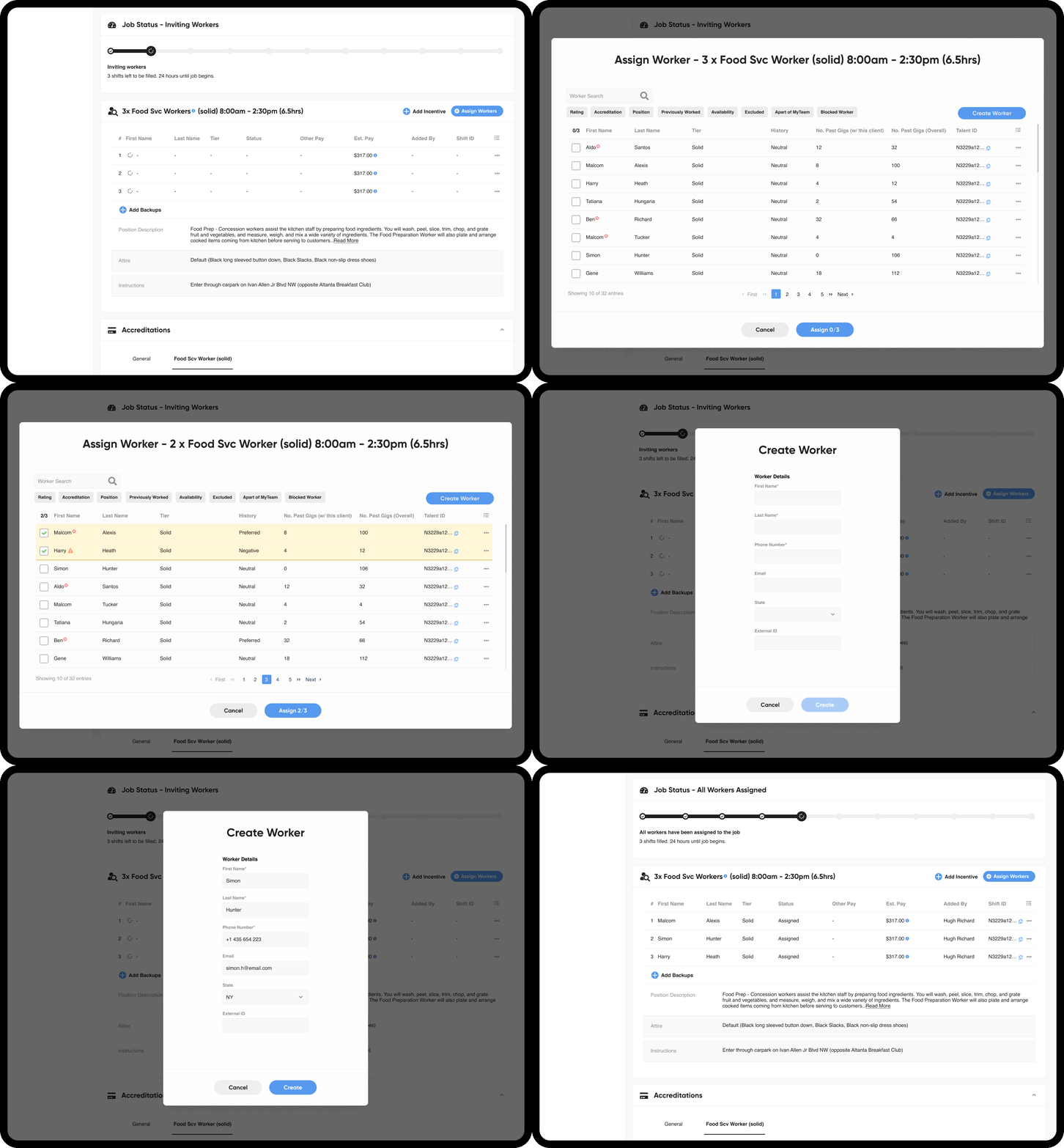
A simple assign-workers modal let agencies search for individual workers or filter by specific requirements — well received alongside the ability to view a worker's history before assigning them. It also became clear early on that agencies needed to create a new worker directly within this flow, rather than backing out to do it elsewhere.
IMPACT
38
recruitment agencies onboarded
1,050
new workers added
300+
jobs worked monthly
Beyond the numbers, agencies consistently pointed to the same thing: this replaced a paper-based, manual process they'd been living with for a long time, with a digital workflow that finally matched how they actually needed to work.
REFLECTION
This project reinforced the value of research with external clients, especially in a niche workflow like agency recruitment — assumptions from internal admin tooling didn't transfer cleanly to how agencies actually operated day to day.
Fast iteration and prototyping made it possible to balance speed with usability, without sacrificing either.
Designing for real-world edge cases — like creating a worker mid-flow instead of forcing agencies to back out and start elsewhere — turned out to matter more for day-to-day usability than any single visual decision.
Targeted UX design paired with agile feedback cycles turned a complex operational task into a structured, genuinely usable product.